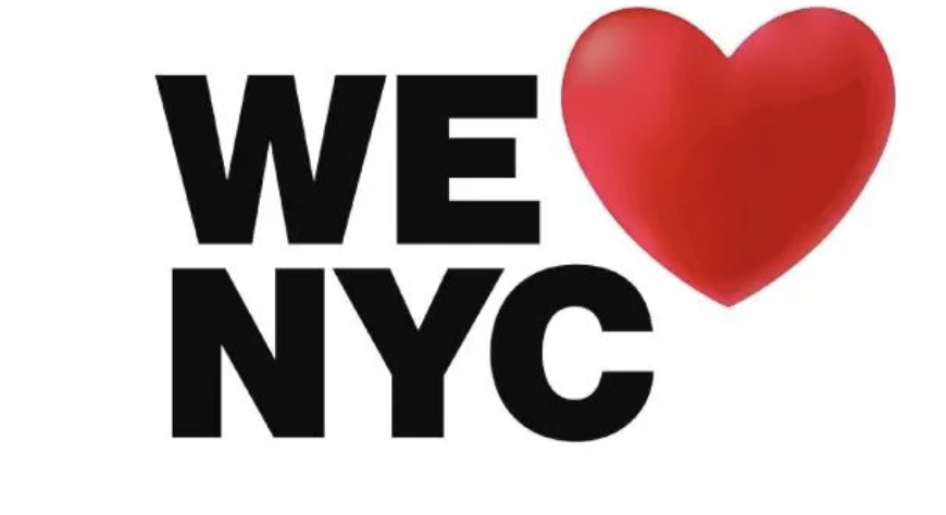
New Yorkers are not loving new ‘We ❤️ NYC’ logo
April 1, 2023
Officials have released a modernized version of the iconic “I ♥ NY” logo nearly 50 years after the original insignia first appeared. The new “We ♥ NYC” logo was introduced by officials on March 21 as part of a new initiative to promote civic participation and volunteerism in the city.
The new logo had a difficult first 24 hours online, where design experts and regular New Yorkers alike began heaping criticism on it. University sophomore Catherine Hussey shared, “I think it’s stupid for them to change it because [the original logo has] already been established…it is just unnecessary.”
The iconic “I ♥ NY” logo is one of the most widely used and copied images in the world. To advertise the city and state, when crime rates were at an all-time high and tourism was at an all-time low, graphic designer Milton Glaser first came up with the universally recognizable logo in 1977. In 1975, President Ford refused government assistance to save New York City from bankruptcy and 1977 saw a widespread blackout that resulted in extensive looting and 4,500 arrests. The subsequent negative press caused tourists to avoid visiting New York. The New York State Department for Economic Development hired Wells Rich Greene, the Madison Avenue advertising agency, to promote tourism in the city.
While traveling in the back of a cab, Glaser first sketched the “I ♥ NY” logo for the city on the back of a scrap of paper with red crayon (some say a napkin, others say an envelope). The final logo would go on to become one of the most well-known symbols around the world, set in the font aptly called American Typewriter.
According to The New York Times, Graham Clifford, the designer who supervised the creation of the new logo, used a modified font found throughout the city’s subway signs. “The subway system is the veins or the beating heart of the city,” he stated. “[You] can have Wall Street types sitting next to construction workers. It’s a place where you can bring everybody together, and we’re cognizant of that.”
According to marketing executive Maryam Banikarim, the design is intended to coexist with the initial “I ♥ NY” design rather than completely replace it. Still, she added, “This is a moment for we, not I.” In addition, the new logo makes a distinction between the city and the state.
“We ♥ NYC’s” creators claimed that it is a symbol for a different time, but they draw comparisons to the turbulent period that gave birth to “I ♥ NY.” Partnership for New York City, a non-profit in charge of the campaign, and CEO Kathryn Wylde mentioned surveys that her organization had carried out during the pandemic. “People in New York want to take part in fixing what they perceive as broken in the city, according to the findings that have been returned,” she said. According to the most recent survey, 67 percent of respondents felt that the city was headed in the wrong direction, but 70 percent of those between the ages of 18 and 40 said they wanted to volunteer to help change that.
In a statement announcing the initiative, Mayor Eric Adams said, “This city overcame the darkest days of the pandemic because of the selfless work of everyday New Yorkers. If each of us gives just one hour a week in an act of service, the result will be transformative.” He continued, “The ‘We ♥ NYC’ campaign asks everyone who loves the greatest city in the world to show it by lending a helping hand and spreading that love to every block across all five boroughs.”

