

University’s new logo receives backlash
@paceuniversity
February 8, 2021
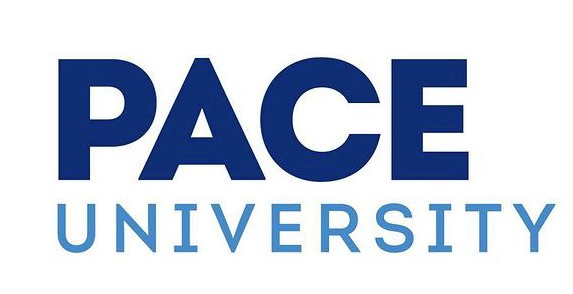
On Jan. 25, the University announced it was launching a new wordmark (a text-only logo) in an effort to rebrand its image.
According to the University’s Instagram account, it took nearly two years of research to create a logo that is “bold, optimistic, simple and unembellished.”
“The upward-pointing, arrow-like capital ‘A’ is accompanied by straightforward, no-nonsense characters. The slab serif ‘I’ in university subtly harkens back to more traditional college identities,” read one of the posts.
View this post on Instagram
The University took to social media to announce the new branding initiative, but a majority of the student body failed to share in the excitement.
Most of the 600 comments on the University’s Instagram post are jokes regarding the simplistic design and outrage over the money spent on a seemingly unnecessary expense.
As struggles with tuition increases, class-action litigation regarding refunds for virtual learning, and See Our Truths‘ efforts to expose racism within the performing arts department affect the community, students are disappointed that the University prioritized rebranding.
University junior and Stage Management major Bailey Wilson shared her opinion of the new logo in the comments section of the Instagram post, “Y’all care more about your brand and how you can sell this university than the actual students and that says everything you need to know about Pace.”
In a poll consisting of University students, 87% expressed negative feelings toward the new logo.
This is not the first rebranding of the University’s logo. Since 2006, the University has adopted a total of five different logos–the past four incorporating the famous “swoosh” logo designed in 1998.
View this post on Instagram
However, constant logo changes have ultimately been proven to reduce brand legitimacy, brand recognition and brand awareness. The longer a brand’s logo has been circulating, the more power it has.
While minimal changes to a logo have been known to update a brand’s image, brands that change their logo completely often create unintended consequences and public backlash.
“The new logo has strayed quite far from the previous one. By constantly changing the logo with only color as a consistent design element, the University is significantly lowering brand recognition,” said University senior and Advertising major Elizabeth Hecht.
While there has been no official statement regarding the student body’s opinion of the rebranding, all the comments can still be found on the University’s Instagram.


Nemo • Feb 19, 2021 at 10:47 pm
I think the new logo is ok, however it is also a shock and it feels like the school is losing a piece of identity and personality. The old logo does look a touch outdated though. I would have preferred Pace to update the old logo in a more modern way instead of changing the lettering completely and altering the color scheme. The new yellow branding does not feel like Pace.